Nevro Rapid Prototyping
Using Rapid Prototypes to Explore and Test New & Unique Interaction Models with Patients

Project Overview
This case study details the user experience (UX) design process for the Nevro Patient Therapy App (PTA) and Pathfinder applications. Developed in collaboration between Karten Design and Nevro with Velentium as the development partner (they replaced Orthogonal several months into the process because due to ineffective communication and lacking the skills needed to bring this product into reality), these applications aimed to provide patients with enhanced control and insights into their HF10 implant therapy. The project focused on creating intuitive interfaces for managing stimulation, tracking progress, and receiving personalized recommendations.
Note: Nevro has changed the “HF10” name to “HFX.”
Project Duration: Feb 2018 – October 2018
My Role: Sr. UX Designer responsible for research facilitation, information architecture, wireframes, prototypes, content inventory, and documentation)
Design Process
Our design process was iterative and collaborative, involving multiple sprints and continuous feedback from Nevro and Orthogonal (later Velentium). Key phases included:
Information Architecture (IA), Application Maps, and User Flows: Defining the high-level structure and navigation for both PTA and Pathfinder to ensure a logical flow for users, and further defining the step-by-step interactions for critical features— from first-time setup, to daily use, and advanced settings.
Wireframing: Creating low-fidelity visual representations of each screen, focusing on layout, content placement, and interaction elements.
Prototyping: Creating prototypes to explore, visualize, and test new and unique interaction models related to changing device settings and other features throughout the wireframing process.
Annotation & Content Inventory: Documenting technical and functional details, and linking wireframes to a comprehensive content inventory spreadsheet for copy and assets.
Key Design Principles
Simplicity: Ensuring that complex medical device interactions were presented in an easy-to-understand manner.
Patient Empowerment: Giving users control over their therapy and access to meaningful data.
Accessibility: Considering features like screen reader compatibility (e.g., for status indicator labels).
Consistency: Maintaining a consistent visual and interactive language across both applications.
First-Time Setup: Onboarding & Device Pairing
The initial setup flow was critical for a smooth patient onboarding experience. This included:
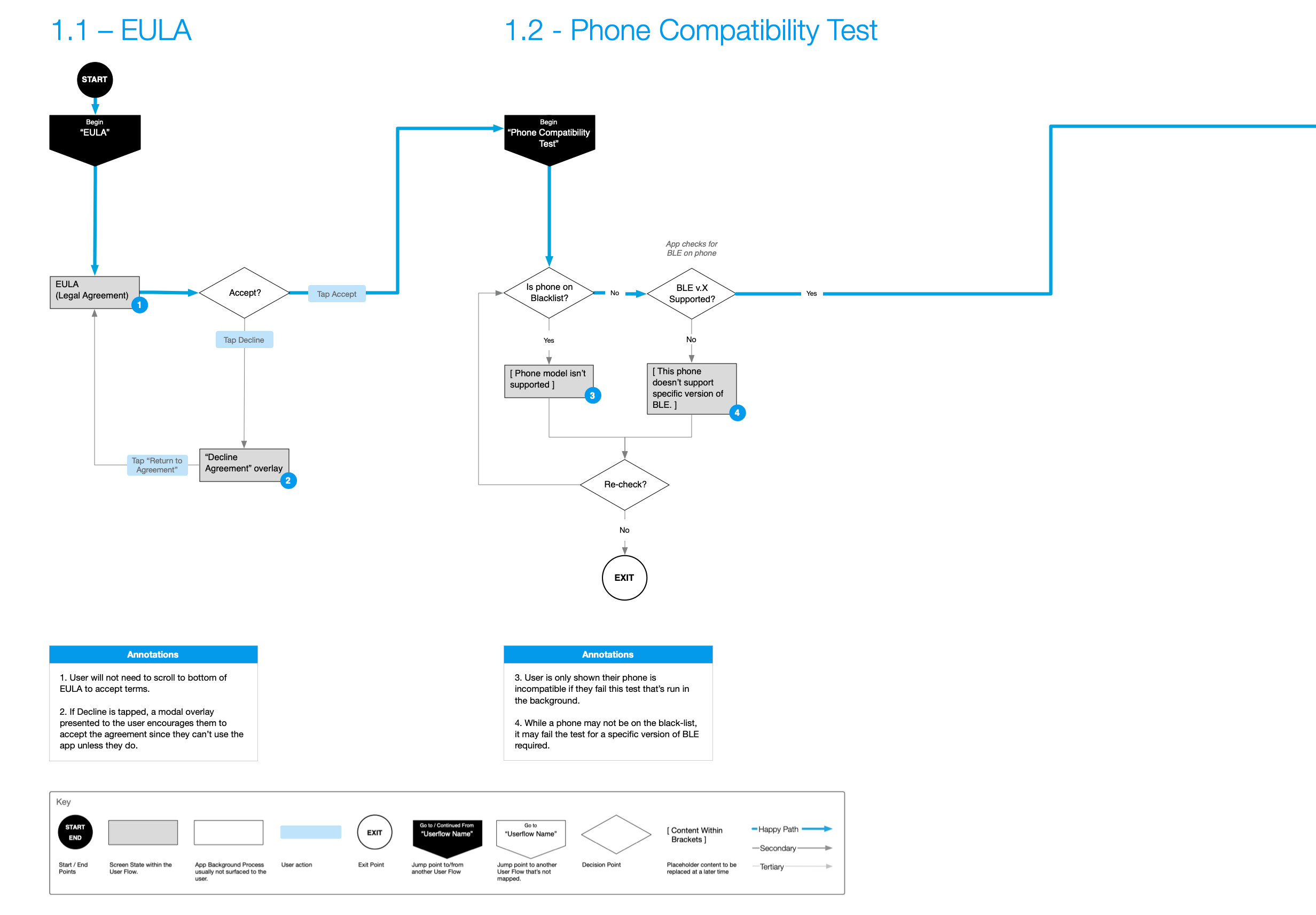
1.1 EULA User Flow – Designed to ensure users understood and accepted the terms, with a modal overlay prompting acceptance if declined.
1.2 Phone Compatibility Test – A crucial step to ensure the patient's device could properly interact with the HF10 implant.
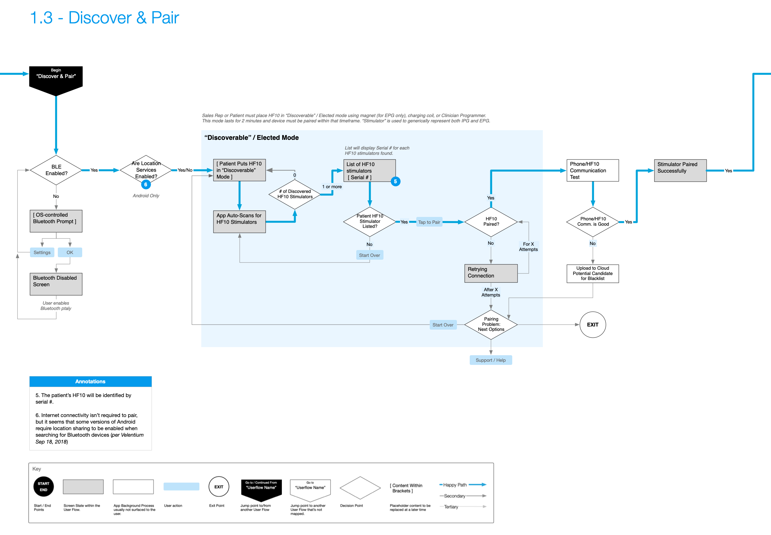
1.3 Discover & Pair – The process for connecting the patient's phone to the HF10 implant.
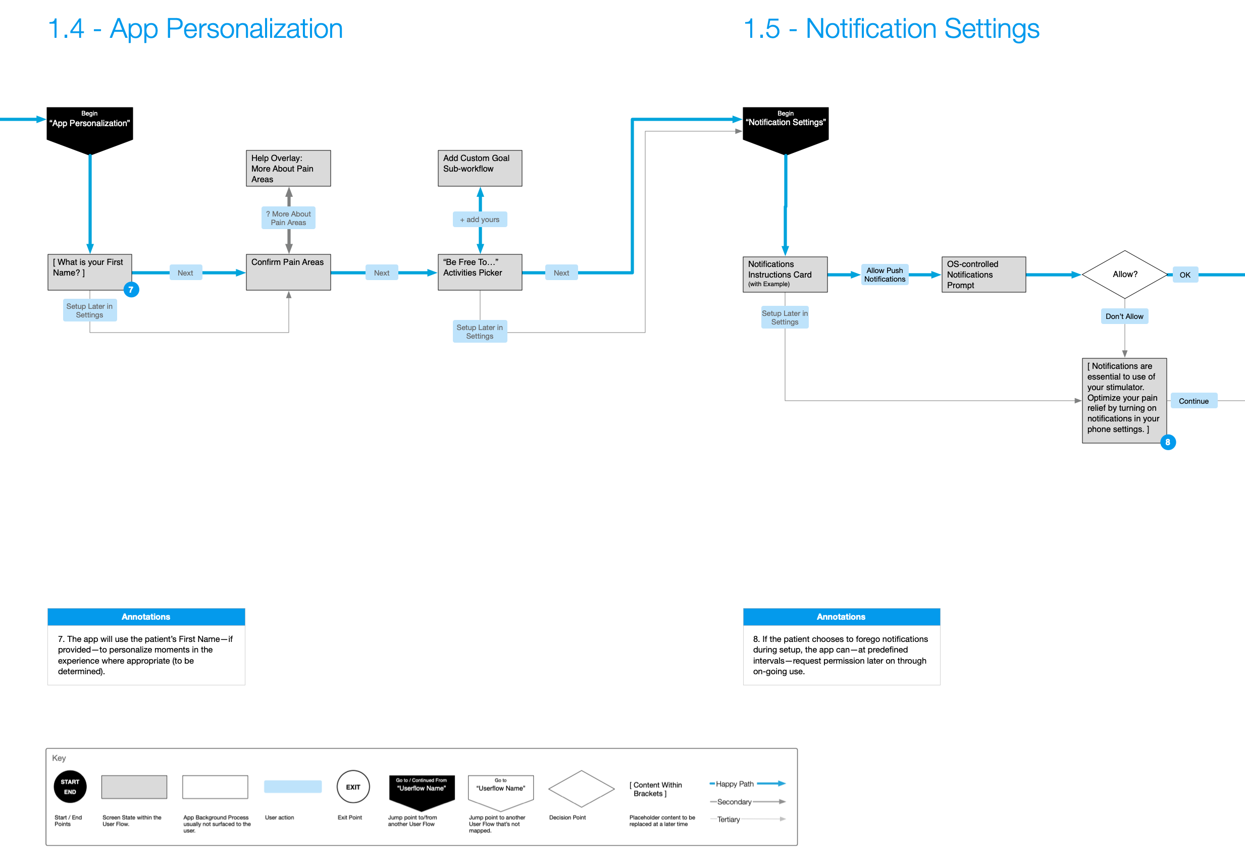
1.4 App Personalization – Allowing patients to personalize their app experience by providing their name, confirming pain areas, and selecting activities they wish to “…be free to…" do again.
1.5 Notification Settings – Configuring how the app delivers important alerts and reminders to the patient.
1.6 App Security Settings – Allowing patients to secure their app with a PIN or biometric authentication to prevent accidental changes to therapy settings.
User Flows
The Challenge
Patients using the Nevro HF10 implant for pain management needed a seamless and empowering digital tool to interact with their therapy. The challenge was to design two distinct yet related applications:
Nevro PTA (Patient Therapy App): A manual control app mirroring the Patient Therapy Remote (PTR) with added features for pain surveys, progress tracking, and favorites.
Nevro Pathfinder: An automatic therapy optimization app that suggests new program settings based on patient data, offering a more hands-off approach while still allowing for adjustments within saved favorites.
Both applications required a robust, user-friendly interface that could guide patients through initial setup, daily therapy management, and data-driven insights, all while ensuring patient safety and data privacy.

Prototype
Here’s a video walkthrough of a basic prototype that I did early on in the project as my team was designing the Onboarding and Device Setup userflows.
Daily Use: Core Functionality
The core of the application revolves around the home screen, where patients can easily view their status, turn stimulation on or off, and adjust their therapy settings. The design prioritizes clarity and immediate access to the most frequent tasks.
Stimulation Control
A simple, accessible power button opens a drawer for turning therapy on or off, a deliberate action to prevent accidental changes.
Home Screen States
The home screen uses a dynamic status card system to show the most relevant information, such as the current program being tested, an active favorite, or a prompt to take a survey.
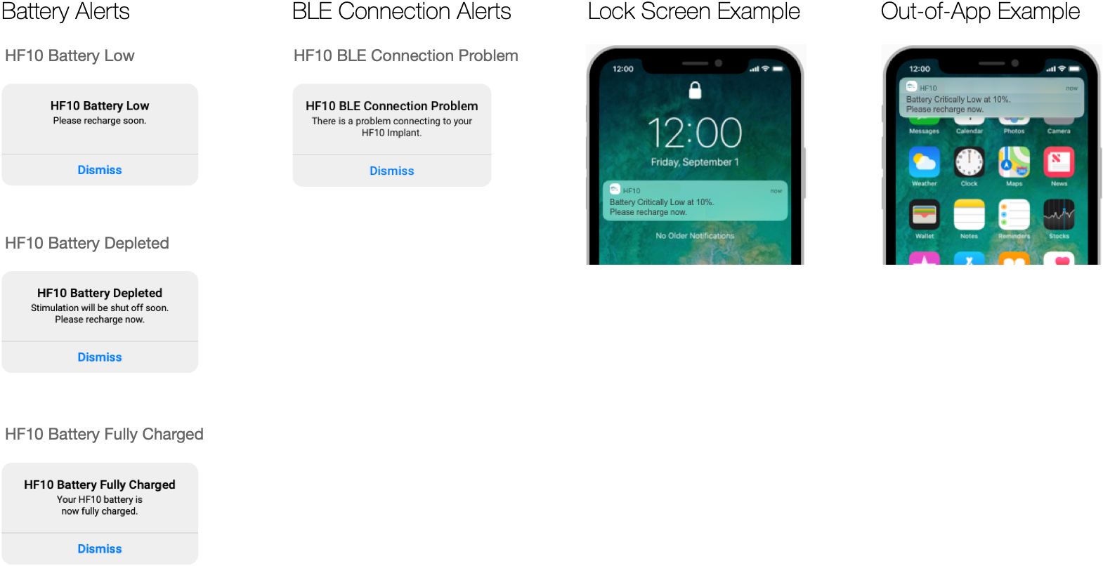
Battery & Connectivity
Critical system states like low battery or a lost Bluetooth connection are communicated through clear in-app alerts and system notifications.
Feedback Loop: Interactive Surveys
Patient feedback is the cornerstone of therapy optimization. The survey module was designed to be quick, intuitive, and engaging. It captures key metrics on pain relief, specific pain scores, activity levels, and medication use, which directly fuel the Pathfinder algorithm or inform the patient's progress in the PTA app.
Visualizing Success: Progress & History
Empowering patients means giving them access to their data in a way that's easy to understand. The "My Progress" section provides multiple views—a graph, a body map, and a program history list—to help patients see trends and understand the effectiveness of their therapy over time.